Which one describes your logo?
Philly 1984. First love. Bold thoughts. Subtle details. Positive impressions. Negative space. In fact, it was love at first sight. Or should I say first assignment.
I’m talking about my introduction to logo design. Think about it… we all can name 10s, if not 100s of companies just by seeing their logo – no name – just their symbol. Logos embody the elements of shape, proportion, type, space and color to help people form perceptions about companies and products. They can be literal or abstract. Logos represent tangible items as well as ethereal concepts. They can imply geography or even motion. Great logos convey the essence of a company in a split second.
Why are logos so powerful? Because 85% of the information we absorb is through our eyes. Logos make an impression – for better or for worse.
So where do the wows and woes of logo design begin?
Here are the 5 rules I use to WOW…
LOGO DESIGN RULE #1
Begin in black & white.
Ahhh…the beauty of black & white. It’s design in its purest form. Nothing but positive and negative space interacting. No color means no distraction. A strong design doesn’t need color to work and, on the flip side, all the color in the world will not save a weak logo.
Black & white at the early stage of logo development focuses all parties to build a quality icon. Introduce color too soon and the best logo may end up in the circular file. Why? Some people have such a strong aversion to a particular color, they can’t see beyond it. Hence the old designer’s creed, “If it works in black and white, it will work in color.”
(I’m not old…the creed is!)
LOGO DESIGN RULE #2
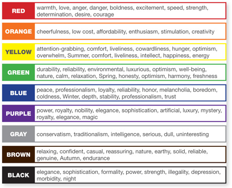
Colors have meaning. Choose carefully.
It’s no secret that colors invoke specific feelings and behaviors. Over time select palettes have become representative of certain industries. And while there are no absolute right or wrong approaches regarding color, there are some things to consider:
“In the red” is a term no one wants to associate with a financial institution, so red as the dominant logo color for a bank is baffling – and yes it exists. Yet as an accent color, red stimulates people to make a decision, so it’s often the color of choice for call to action in print and on the web.
Then you have green, “the color of money”. Unlike red, green is a natural choice for financial institutions, but it also rules supreme in the environmental world. How can you think green without being some shade of green?
Some other color trivia…Orange increases your appetite. Might explain why I leave Home Depot hungry. Paint a guest room yellow…It feels warm and inviting at first, but yellow is an energy color, so it’s hard to stay at rest for very long (translation: guests won’t overstay their welcome.)

(source: changingminds.org)
LOGO DESIGN RULE #3
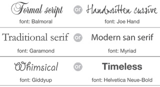
Fonts – Friend or Foe?
Logos typically have 2 components: the graphic icon itself and the typeface chosen for the name and tagline. Type selection is just as important as the icon. Fonts can imply innovation, tradition, motion and even humor. They can convey expertise or shout at you like a used car salesman.

The wrong font will fail to communicate what a company represents. It can make the logo difficult to read and mostly likely hard to reproduce. Type can also become dated, especially script faces and highly stylized fonts. Choose carefully.
Awesome Helpful Hint…
Can’t put a name to a typeface? What The Font! No, I’m not kidding. MyFonts.com has created this great resource for designers and non-designers alike. Simply upload a digital sample of an unknown typeface in the form of a JPEG, GIF, TIFF or BMP and this site does an amazing job of identifying it. I’ve used the site over a dozen times and it only struck out once in finding the exact typeface. Instead, it gave me alternatives that were close in style. They even have an iPhone app. Try it out!
LOGO DESIGN RULE #4
Size and proportion matter.
Graphics and type have “visual weight” created by their size, density & mass. If all elements are of equal “weight”, the eye struggles. It doesn’t know what to look at first. This need for balance is more an issue in page layout, but logos can fall victim, too.
During the design process, logos are often viewed as a free standing element on an 8.5 x 11 page. Problems may not be noticed until the logo is reduced for business cards or small promotional items. Ask these questions…At a small size will the tagline remain readable, will knockouts (white elements reversed out of solid background) fill in or will rules break up?
Here’s a technique I use as a test… First, show the logo large and centered in the page. Second, duplicate it, scale it down to 1” in width or height, depending on its orientation, and tuck it in the lower right corner of the page. This way I will see if a problem exists, before it even goes to the client; and the client has a realistic expectation of the logo’s reproducibility. I always do this is at the black & white stage, but it’s equally important to monitor how the color version will reduce as well.
LOGO DESIGN RULE #5
Even the best logos need to evolve.
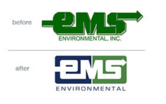
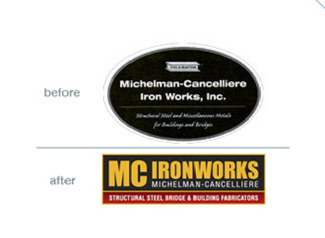
Just as design trends affect cars, clothing, art, homes and more, logo identities also evolve. It’s a form of natural selection. Images once revered in the 70’s and 80’s, have been retired, so that a new generation of logos could be born. This transformation has happened to brands you know very well. Unfortunately, not all of them improved for the better. Check out these logo transformations and you be the judge.
Evolution is sometimes extreme, but often all that is needed is a refresh…updating type, adjusting proportion, streamlining graphics and rethinking color. Subtle changes can help a logo shed its dated look and launch it into the 21st century, without having to reinvent the wheel. And then again, some times you need a fresh start. Here are two examples, created by BlattCom:


Take a close look at your company’s logo identity. What is it telling you? More importantly, what is it telling your customers?
Until the full moon in April, remember…your image is an asset. Build it well.

Lori Blatt
Owner, Blatt Communications
610.987.9202
lori@blattcom.net

