And how to make the most of your printing
If you have never developed a brochure, I can assure you, it’s a bit like giving birth. You will labor over building the right message, sometimes agonizing over a single word. Then there’s the task of finding the right imagery. And frankly, if your company’s mission, USP and branding is not already firmly in place, you will need an epidural until it’s done.
But here’s the great news…It’s so worth it.
Going through the process of writing and design marketing materials challenges us to take a hard honest look at what we do, who our audience is and what their pains are. Gone are the days where brochures simply pontificated about the company. Today, the message needs to speak to the specific needs of the customer and the specific skills and expertise you have to provide solutions.
This is not an undertaking you’ll knock out in a week. Be sure to allow enough time for developing your brochure content. It will take several weeks, perhaps even months. Why so long? Sometimes, it’s the chain of approval. But most of the time it simply comes back to believing in the company and its services and being confident enough to put those beliefs in permanent ink.
It’s this sense of permanency that causes the most anxiety about the process. I often see brochure projects move quickly through the copy drafts and then as we as begin to use the words “final layout” or “proof”, the momentum comes to a screeching halt. Although deadlines are always looming, the best thing you can do is walk away for a day. Working on the project continuously, we get too invested in ever little nuance. Taking a break is truly therapeutic, providing quick resolution to those few remaining items that stalled the approval process.
Sharing the near final layout with a 3rd party can beneficial as well. Along the way you’ve probably shared this with the appropriate people within your company. I’m talking about one or two unbiased individuals who have not been living and breathing the project and will have fresh perspective on your visuals and copy. Be open to constructive criticism. Just don’t go overboard with sharing. The old adage of “too many cooks in the kitchen” applies to marketing and design. In our industry the saying is, “rule by committee is the fastest way to create a mediocre piece”.
Get the most out of what you print
Another source of confusion is the printing process itself. So here’s some insight on how to get the most out of your printed materials.
Understanding Color

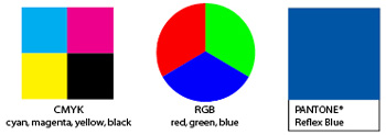
CMYK
Cyan, Magenta, Yellow and Black are the building blocks of print. CMYK is also referred to as full color or 4-color process. Each of the four colors can range from 0% to 100% and these combinations give us an amazing spectrum of colors.
RGB
Red, Green and Blue are the dots that create the colorful screen experiences on our computers, TVs, cell phones and this is also the native color profile for digital photography. If an RGB image is going to be used in print, then its color profile will be converted to CMYK.
Pantone Matching System (PMS)
Pantone was developed in the early 1960s to give companies, designers and printers a common standard for communicating and controlling color. In the printing process, PMS colors are considered spot colors and have nothing to do with CMYK. Many PMS colors can be replicated with a CYMK build to a certain extent, however, there are just as many that can not duplicated.
Bleed vs Non-bleed
What it means
“Bleed” is an industry term meaning that the color runs off the edge of the paper. Bleed is achieved during the design process by extending backgrounds, graphics and images beyond the trim (a.k.a. final size) of the page. The piece is then printed on paper that is larger than the trim size. This effect gives printed materials a more professional and high-end look.
More and more companies are printing marketing materials in-house to save money on low volume documents. Color copiers have improved tremendously, making it harder to distinguish an in-house color copy from a professionally printed piece at a quick glance. But there is a tell-tale sign and it’s all in the margins.
Design with the margins in mind
In order for a file to be set up properly, we ask if bleed is an option before we begin the design. If it’s not an option, margins can be built into the design so they look like a natural part of the layout. Without planning, problems will arise because of the copier’s inability to take color all the way to the edge. If the copier default settings are utilized, margins can vary in width from top to bottom and left to right. If text and graphics are placed too close to an edge, these margins can cut off important pieces of information, making the job look amateurish.
Choosing the right quantity
Determining quantity depends on the purpose of the piece. Quantities for direct mail will be driven by the size of your list and the frequency of the mailing. Stationery should be purchased based on what you use in a year, but resist purchasing more than 2 years worth at any one time. Why? Because stocks can yellow, glue on envelopes can dry out and large quantities can be a hassle to store.
A similar philosophy should be applied to corporate and product brochures. Consider how the brochure will be distributed:
• Sent to existing customers
• Used as a leave behind with prospects
• Included with a RFP response
• Mailed as to tradeshow leads
• Displayed in literature racks
Once you have a sense of how the brochures will be used you can project a final quantity. If you have developed your content to be “timeless” double this number for a 2 year supply to get the best price per piece, but no more. While the theme of this full moon issue is print for permanency, bear in mind that your company is always evolving and your brochure will need to evolve with.
If the brochure content has very specific information about products and services that is subject to change or the company is in acquisition mode, select a lower quantity. This way you will minimize potential waste when updates are made.
Digital vs Offset
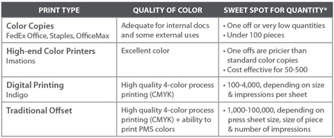
Digital printing has bridged a gap between the capacity of color copiers and traditional offset printing. In my opinion, digital printing has given smaller businesses the opportunity to have professionally printed collateral materials at a reasonable rate.
Here’s a rough breakdown of how they compare.

*Disclaimer: There is more involved than I can explain here sheets versus impressions. Your take away from this chart should be that you need to talk with your creative team and printer to determine what printing method is going to give you the best end results for your budget. You’ve got options!
Gang Printing
Over the last few years, I’ve received an increasing number of promotions from far away printers offering postcards and business cards at incredibly LOW prices. They can offer bargain basement pricing because of their printing technique. Gang printing is a term for filling up a sheet with items that are all the same size, like business cards. When you have a hundreds of business cards on a single form, the cost per piece plummets dramatically.
I had serious reservations about these companies and readily dismissed them. I didn’t think the quality would ever meet my standards. Then I tried GotPrint and now I’m a convert. The quality has been consistent and the pricing can’t be touched my pool of trusted offset printers.
Now there are limitations to this type of printing. The trade off for decent quality and low price is: lack of speed, stock options and personal interaction.
The quoting and purchasing process is entirely wed-based. You can have a live online chat with a rep, but that’s about as personal as the customer service experience will get (unlike the donuts from Brandy at Colorworks). These companies offer a core group of products and run these items on a predetermined schedule. Delivery is on their timeline, so this not the place for a rush project. You are also limited by a preset array of sizes and stocks. Bottom line: if you can work within their print options and time constraints, they can be deliver incredible value for the money.
If you are handling your own print
Take the time to understand the print specifications of your project. Write them down in a formal “quote request” versus dictating verbally over the phone. You will not get an apples-to-apples comparison if printers are not basing their estimates on the exact same set of specifications.
Rule of thumb…Get 3 estimates from comparable printers. If you see more than a 10% difference between the high and low estimate, ask questions!
In this age of web sites and online marketing, the printed word still matters. Some would argue that a web site can replace the need for a brochure. I have long believed the two complement one another – providing prospects multiple ways to assimilate your message.
So take a deep breathe and dive into creating a brochure that will be a powerful tool in your overall marketing toolkit.
Until the full moon in September, remember…your image is an asset. Build it well.

Lori Blatt
Owner, Blatt Communications
610.987.9202
lori@blattcom.net

